OCTA

Building a Unified Parent Brand

OCTA tasked Distl with creating a cohesive brand that not only unifies its portfolio of clean energy, low‐carbon companies but also resonates with its target audience of mining executives and fund managers. As a newly formed parent company, uniting brands such as Clean Energy Fuels Australia (CEFA), EVOL LNG, and PWR Hybrid, OCTA needed a strategy that communicated both its technical expertise, financial backing and its approachable, customer-first ethos.

Understanding the Challenge

OCTA’s journey began with an in‐depth workshop that brought together key stakeholders including founders and senior executives. In these sessions, key team members shared their experiences and insights into the evolving energy landscape. They discussed the company’s growth from its early consultancy days in 2009 to its recent expansion into energy plants and hybrid solutions. The workshop highlighted OCTA’s core strengths: collaboration, approachability, and deep industry expertise.

OCTA’s brand creation had two main objectives. First, they needed to clearly articulate their role in energy transition – helping mining companies shift from traditional, diesel-reliant power sources to more sustainable alternatives. Second, they wanted to create a brand platform that would appeal to both their operational customers and potential investors. This meant establishing credibility in a competitive market where major competitors already have a strong presence.

Laying the Strategic Foundation

The objective was to develop a clear brand purpose and positioning that reflected OCTA’s commitment to driving decarbonisation and enhancing operational efficiency for heavy industry clients. OCTA’s brand purpose is defined as follows:

“By deploying capital in clean energy and low‐carbon solutions, we help our heavy industry clients enhance their sustainability, bottom line and shareholder relations, whilst also improving the health and sustainability of our environment.”

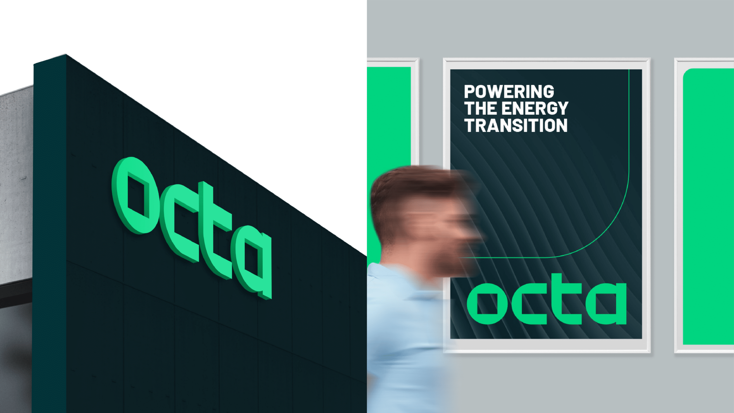
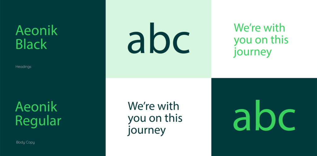
This purpose was central to the strategy, Distl’s brand strategist, Kate, worked closely with OCTA’s leadership to identify core brand values such as collaboration, approachability, and a customer-centric focus and the point of difference. The point of difference and brand values not only guided the visual identity (illustrated below) but also the tone of voice and messaging across all communications.

The strategy also involved a careful analysis of the competitive landscape, ensuring that OCTA would stand out as a challenger brand with unique, tailored solutions despite operating in an arena populated by larger competitors.

Developing the Visual Brand Identity and Brand Theming

With the brand positioning strategy in place, the next step was to bring OCTA’s identity to life visually. As agreed with the OCTA team, the visual identity needed to reflect several key attributes:

  • Technical and Mechanical: Conveying expertise and reliability.
  • Modern and Contemporary: Signalling innovation and forward-thinking.
  • Fresh and Approachable: Creating a dynamic yet professional feel.

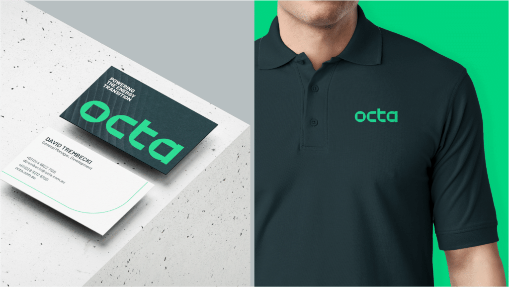
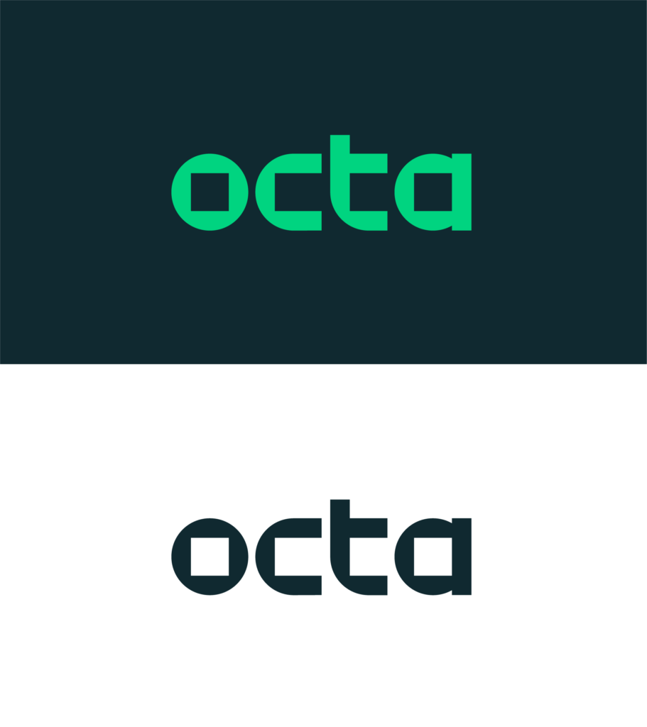
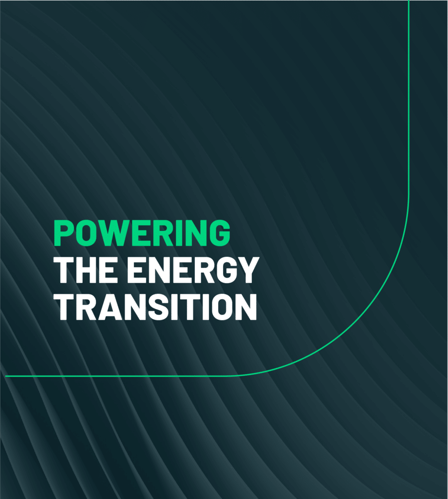
Distl’s design team crafted a new logo design and visual system that encapsulated these qualities. The logo was developed to subtly reference the name “OCTA” through geometric elements, symbolising the idea of multiple facets coming together to form a cohesive whole. The chosen colour palette, featuring tones that are both vibrant and grounded, reinforced OCTA’s dual focus on innovation and dependability.

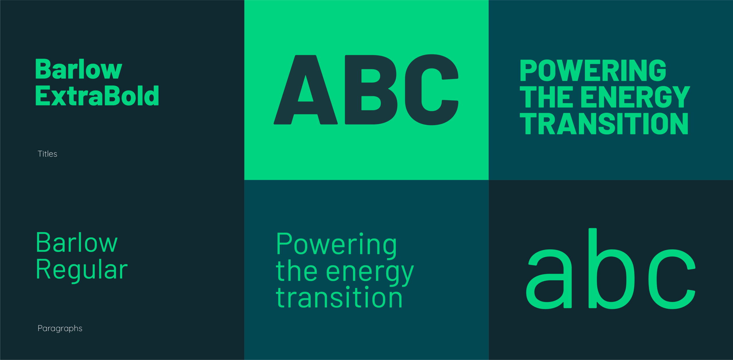
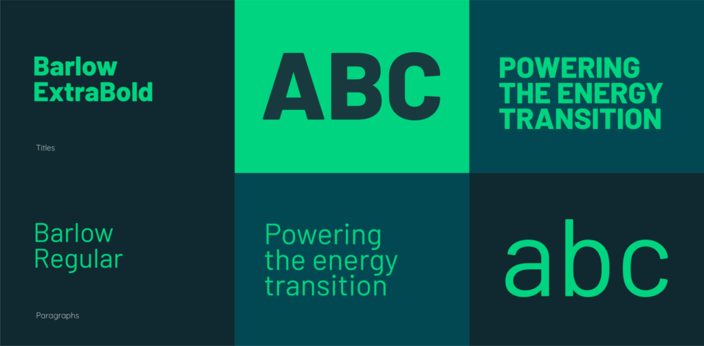
Typography and graphical elements were also carefully selected. A modern sans-serif font was paired with graphical devices that echoed the structural precision of the energy transition industry, yet remained friendly and accessible. The resulting visual language was designed to be versatile, enabling OCTA to maintain consistency across digital platforms, marketing collateral, and investor presentations.

Full-Service Collaboration: Brand Strategy to Website Design

Our engagement with OCTA encompassed both the strategic and executional elements of brand development. Once the brand strategy, visual identity, and brand narrative were finalised, our brand team ensured that every aspect of OCTA’s brand presence was aligned and consistent.

A New Website Design and Marketing Collateral

One of the key inclusions needed to bring this newly articulated direction to life was an updated website design that embodied this refined brand identity. The site was designed to be visually engaging, using the newly developed colour palette and graphical elements to create a modern, dynamic web experience. Clear, concise copy, rooted in the messaging framework, helped articulate OCTA’s value proposition and brand purpose correctly on the landing page. The website’s structure allowed potential clients to easily understand OCTA’s brand position and point of difference, setting it apart from competitors.

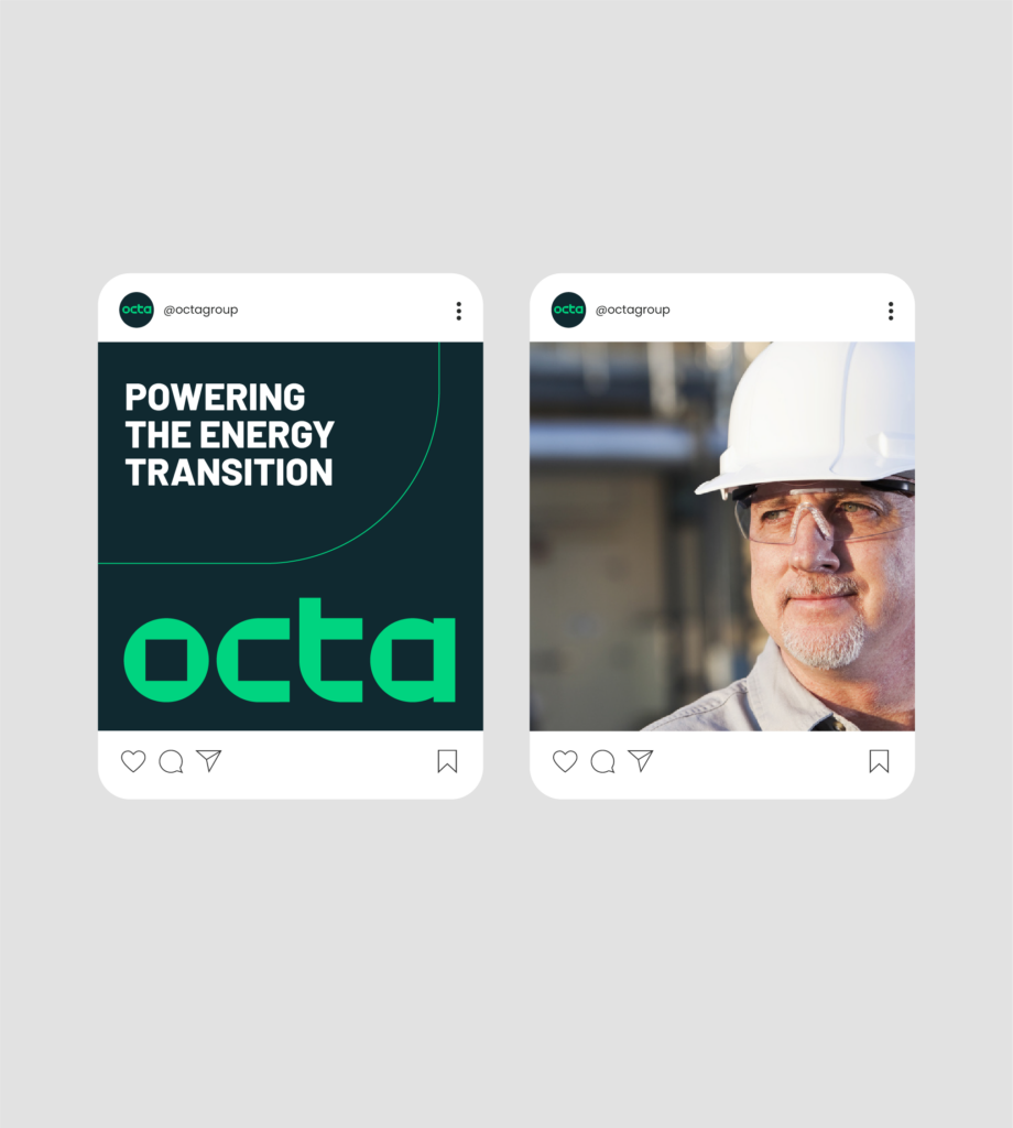
In addition to the website, Distl also produced a suite of marketing materials, including sales presentations and social media graphics. These collateral pieces ensured that every interaction, whether online or offline, reinforced the OCTA brand and its commitment to excellence in the clean energy space.

Collaborative Execution and Continuous Refinement

Throughout the project, Distl maintained a close, collaborative relationship with the team at OCTA. Regular review meetings and iterative feedback loops allowed us to fine-tune every detail of the brand’s development.

The open communication channels established during our all-in workshop and presentations are invaluable. They allowed OCTA’s leadership to stay involved in every phase of the process, resulting in a brand that truly reflects the company’s identity and ambitions. The collaborative spirit not only ensured that the final deliverables met OCTA’s high standards but also built a strong foundation of trust and mutual understanding between our two teams.

The Impact and Future Outlook

Internal teams have reported greater clarity in messaging, expecting an improvement to marketing initiatives and sales efforts by demonstrating a clear understanding of how OCTA’s sub brands work together. Externally, the consistent, professional brand presence is expected to build credibility among both customers and investors, a critical factor as OCTA positions itself for future growth in the clean energy sector.

The unified brand identity has also paved the way for future expansion. With a clear, adaptable brand platform in place, OCTA is well-positioned to integrate new portfolio companies and communicate its evolving value proposition with ease. For Distl, this project is a testament to the power of a comprehensive, collaborative approach to brand development, one that marries strategy with creative execution to build brands that are both distinctive and enduring.


By partnering with Distl, OCTA has transformed its brand from a set of disparate elements into a unified, credible, and engaging platform. If you’re looking to elevate your brand with a strategic, full-service approach, let our team show you how we can help you achieve a similar transformation.

Ready to build a brand that resonates? Contact Distl today to start your journey.

Request a quote
Credits

Client

OCTA

Services

Related projects

All branding

Yard Property

A Digital Transformation to Drive Community Collaboration

BrandingWebWebsite DesignWebsite Development
Read more about Yard Property – A Digital Transformation to Drive Community Collaboration
Fair Go Finance Typography and Colour Palette

Fair Go Finance

An Online Lender Doing Things a Little Differently

Branding
Read more about Fair Go Finance – An Online Lender Doing Things a Little Differently

Adage Furniture

Bringing venue visions to life

BrandingContentDigital StrategySEO
Read more about Adage Furniture – Bringing venue visions to life

Before you pick us,
pick our brains

No more missed opportunities. No shoehorning, railroading or using a jack hammer to crack a walnut. No more wasted branding, web or marketing dollars.

Contact us

08 9381 4441

Get directions

3/73 Troy Terrace
Jolimont WA 6014