Let’s get started
we’d love to hear from you.

The right font, chosen with care and consideration, can be used to convey a particular emotion, set a certain mood, and even reflect specific trends. Your designer will have spent a significant amount of time behind the scenes considering the relationship between the look of a text, the content of the text itself and its role in shaping your brand.
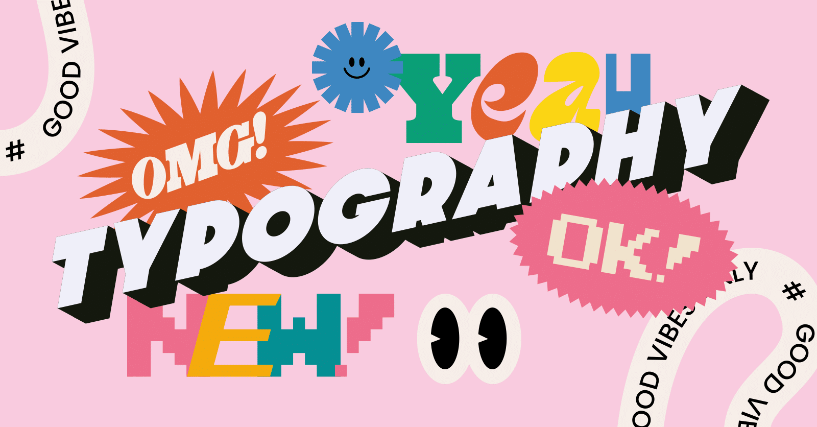
So, what actually is typography? Why is it so important? And how can different moods, atmospheres and even trends be reflected in the type of typography you ultimately choose?

One way of understanding typography is as the art of arranging letters and text. In general, when a designer settles on a particular type of font, they’ll be considering how their choices make the copy legible, clear, visually appealing, and reflective of the intended messaging and branding.
Typography can make a big difference in public perception of and engagement with a brand. You can break typography down to the following components, each of which has a role in eliciting certain emotions of the reader or conveying specific messages in a subtle but distinct way.
Style refers to the distinctive artistic choices made in choosing a font, from its uniqueness to its aesthetic quality.
Appearance specifically refers to the visual qualities of a particular font, such as its colour, shape, texture and overall look.
Structure in typography is about how the letters are arranged and organised.
Typeface is all about how the characters look. It covers things like how thick the lines are, the shape of the letters, the style, and the overall vibe. It’s like the artistic blueprint for a set of characters. So, if you think of Times New Roman, that’s a typeface. On the flip side, a font is like the practical side of things. It’s a digital file that includes details like size, style, and weight of the typeface. Essentially, it’s how you use your chosen typeface in different situations.
For instance, if you’re using Times New Roman as your typeface, your font might be Times New Roman Bold at 24 points.
Weight in typography refers to the thickness of the lines, or the heaviness of the letters. The thicker your chosen typography, the bolder it will appear. Hence, most word processors offer the option of bolding your letters to increase its thickness and weight.
Leading refers to the vertical spacing between two lines of text. The more space included in the copy, the greater the emphasis is on its importance, legibility and visual hierarchy.

Tracking is all about the space in your text. But instead of the space between lines (like leading), tracking is about the space between individual letters in a word or a chunk of text. When you give those letters a little more room to breathe, it can make your text easier to read.
Kerning is similar to tracking but it’s about adjusting the amount of space between pairs or groups of letters. It can be used to great effect when wanting to strike a visual balance with awkward letter combinations.
Serif fonts are traditional and classic in their appearance. If you’re looking for something elegant yet familiar, Serif font types are a good place to start.
On the other hand, for a more modern look, Sans Serif is a good option. This clean and distinct typography has less of a ‘flourish’ and looks simpler and more straightforward.

Script fonts are more characterised by nature. Similar to one’s cursive, handwritten style, they denote a certain type of brand personality – one that is less corporate or professional and more personable or artistic.
Display fonts should be used for specific applications only: Such as attention-grabbing headlines or particular logos that want to make a bold, head-turning or iconic impact.

Monospaced fonts are distinctive. Often used to evoke imagery of coding or vintage typewriters, they can certainly be on brand for some organisations. However, you need to consider your target audience and think about what sort of message it conveys about who you are and what you do.
Used carefully, there’s something charming about hand-drawn fonts. The personal, low-key touch can help craft a unique and authentic feel with a brand.

Think about your brand. What sort of personality do you want to convey? What are the values of your organisation that you want to encapsulate? And, equally important, who is the target audience you are trying to appeal to?
Your typography needs to be readable and legible, regardless of your artistic likings. Think about letterforms, height, size, thickness and proportions. What works best for your brand whilst still managing to be easy to read?
Now is the time to drill down on which aspects you want to emphasise. Different weights, such as bold or italic, can draw attention to specific parts and guide where your audience’s attention goes.
Combining fonts can be an effective way to create contrasting harmony and ensure visual interest in your designs.
To sum it up, typography might seem easy at first, but picking the perfect font for your brand can be trickier than you think.
If you want some advice or help with your branding, don’t hesitate to talk to our team of experts at Distl. We’re here to assist you, and it all starts with a friendly chat – no pressure or commitments. Feel free to reach out to learn more about how we can enhance your brand’s look.
No more missed opportunities. No shoehorning, railroading or using a jack hammer to crack a walnut. No more wasted branding, web or marketing dollars.

David Metcalf
Director
we’d love to hear from you.